UI component explorers — your new favorite tool
Building complex UIs one component at a time

UI components make you think reusable, predictable, and modular. This may be true for small apps where you can easily recall each component from memory. As an app grows teams encounter two challenges: there’s a flood of components and component complexity increases. What is, in theory, a solid architecture for building modern UIs becomes unwieldy in large apps.
How can frontend engineers ensure their modular UI adapt to evolving requirements and increasing scope? Let’s see how component explorers are crucial to frontend professionals for taming the requirements of building and growing modern apps.

Modularization
Two hundred years ago pioneers of the industrial revolution built complex machines and streamlined manufacturing to make goods and services more accessible. Less than a decade ago our friends in devops landed on microservice architecture to create modular distributed systems. Today’s frontend engineers seek to build modular UIs to assemble more powerful and complex apps.
The recent adoption of these frontend patterns have finally enabled frontend engineers to make headway on building web app interfaces in a modular way.
- Standardized components: Idioms established by popular frameworks like React, Angular, and Vue leads to consistency between components.
- Page-agnostic components: Components are designed to live in isolation from their intended setting and data context
- State-based view layers (i.e., declarative templating): “The separation of UI state, the underlying logical situation of what the user can see, from the layout (DOM).” — paraphrased from Tom Coleman
Component explorers
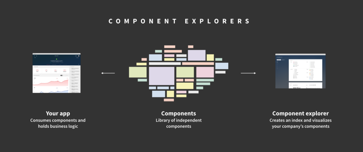
Component explorers help engineers build modular UIs by visualizing components so that they can be constructed in isolation of an app’s business logic and layout. They allow you to simulate component states for testing and serve to index your app’s UI components for later reuse. Consider a component explorer a dictionary for your modular UI that lives alongside your production app[s].
Robust user interfaces
Engineering is prone to bugs. The essential complexity in building apps is inescapable. Component explorers seek to mitigate inconsistency by showing the many states of components.
Highlighting the various permutations enables developers to build each state independently. All states of a component can thus be tested in isolation and the states that are particularly difficult to replicate can be mocked (e.g., loading). Toggling between permutations helps engineers quickly verify what’s expected and fine tune the interactions or animations between states. Just as machine tools like lathes are useful for building mechanical parts, a component explorer is a useful interface for building interfaces.
Rapid development
As Fred Brooks wrote in Mythical Man Month, “… our ideas are faulty, we have bugs”. The first product release cannot be the last because the subsequent iterations are needed to iron out the bugs in our thinking and code.
Our ideas are faulty, we have bugs
Since ideas are prone to bugs, apps must be easily adaptable to accommodate new learning. Dissecting UIs into interchangeable components enables rapid reconfiguration of the pieces as business needs change. The component model encourages interchangeability by isolating component state from business logic. A component explorer makes this separation evident by providing a sandbox to develop the UI component in isolation of the app.
The model also allows for parallel production where a team of people can work on different pieces of the UI simultaneously without distraction or state pollution from other parts of the app. The combination of interchangeability and distributed production enables rapid product development. In short: your team gets things done faster.
Documented, organized, and reusable
Reuse is the major source of cost-savings in any industry development notwithstanding. @WalmartLabs re-uses components across a dozen high-traffic sites to shorten features’ time to market. Facebook has a dedicated UI component team to make, adjust, and approve new pieces of interface. HubSpot relies on a component explorer for discoverability and documentation of in-house components.
Building quality interfaces cheaply seems like a contradiction. However, in a component explorer, you have a tool which does the heavy-lifting for documentation and organization resulting in reusable UI components at little impact to the project speed.
Collaborative
UI engineering is inherently visual. Code-only pull requests are an incomplete representation of the work. In order to truly unlock collaboration UI must be made real. Visualizing components allows developers create scannable artifacts that are easy to share with collaborators and stakeholders.
How does it work?
A component explorer is packaged as a small development-only standalone app that lives alongside your app. Installing one is as easy as downloading a package.
Primary features
- Sandbox for isolated component development
- State visualizer for component discovery and specification
Process
- Build components in isolation
- Register the component with the explorer
- Specify state and stub data from within your component’s directory (e.g., a developer might use a factory to generate randomized data for your
exampleListItemcomponent or hardcode states they specifically want to test)
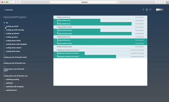
0%, 50%, 100%, and completed states. (Chromatic)Where do I get one?
Component explorers are invaluable for teams to discover, visualize and simulate states of components. The industry is still in the early phase of adopting component architecture so expect the tooling to mature quickly. Below is my shortlist of promising projects.
React
- Storybook is a UI development environment that allows you to visualize different states of your UI components and develop them interactively. Notably, it offers the ability to toggle between user-specified component “stories” (i.e., states).
- Styleguidist is a styleguide generator for components. It helps you render components in different states, document them in markdown, and export that as a static site.
- React Cosmos scans projects for React components, loads them inside an explorer, and renders your components under any combination of props| context|states. Ovidiu argues the case of component independence.
- Carte Blanche is an isolated development space with integrated fuzz testing for your components. It allows you to list your app’s React components and toggle between user-specified component “examples” (i.e., states).
- Compositor Lab, a paid Mac app, is a component development environment that helps you build components and assemble component libraries. It visualizes component states in isolation and allows you to live-edit props in app.
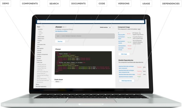
- Electrode Explorer indexes your React components from NPM, manages versions, tracks dependencies, and shows usage across your app. Note that it doesn’t support toggling between component states. It was built by @WalmartLabs; read the overview by Alex Grigoryan.
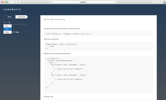
- Chromatic for Meteor + React organizes your components and allows you to toggle between state. It provides presets for screen-size and background color to see how components render in different contexts.
- Bluekit collects all your React components in one place and renders them with editable source and live preview. It supports editing individual props, but doesn’t have the ability to toggle between states.
Vue
- Storybook now also supports Vue (see above)
- Vue-play allows you to list your Vue.js components and toggle between user-specified component scenarios(states).
Ember
- Ember Freestyle showcases live components from your app in a “living” styleguide. It’s a component explorer alongside documentation.
ClojureScript
- Devcards lists your components, shows all their states, and allows you to add prose to component documentation. View the demo.
Angular
- Storybook now also supports Angular (see above)
- UI Storybook is an environment for Angular developers that helps visualize different states of your UI components and develop them interactively.
- Playground helps you work on components, directives, and pipes in isolation.
iOS, Android
- Tell me about one !
Have component explorers piqued your interest? Sign up to our mailing list to get updates on best practices for UI components and more.
Frequently asked questions
What’s the difference between acceptance tests and component explorers?
You can write visual acceptance tests but they are brittle and generally not worth it (although the benefit is that they are automated). A component explorer gives you many of the same benefits of listing/detailing states you might want from tests. However, eyeballing component states instead of writing acceptance tests actually ends up being a lower effort way to have coverage of the various states your users might end up in.
What’s the difference between component explorers and readymade UI frameworks like Bootstrap, Material, and Foundation?
Component explorers are complementary to UI frameworks like Material and Foundation. Whereas readymade UIs offer a menu of options for visualizing their widgets they do not map back to the state of the user in the system.
For example, a form input might have disabled, error, and default looks in Bootstrap. When we want to see these looks through the lens of system or user state like loggedIn or loggedOut we use a component explorer.
How does this actually fit into the app buildout?
Get a 5-step overview of how Chroma designs and builds apps using UI components below:
 Dominic Nguyen