UI Component Playbook
A 5-step guide to designing and engineering frontends with components

People gauge the quality of software not just by how well it works but also how it feels. How an app feels is intrinsically tied to frontend development because it is the developers who’re ultimately responsible for shipping the 0’s and 1’s that people touch. So any team that seeks to improve the app experience must consider the app frontend.
Today, I’ll walk through UI components, which offer concrete improvements in the speed, cost, and quality of frontend development. We’ll see how the paradigm shift to UI components complements Brad Frost’s Atomic Design and Tom Coleman’s Component Driven Development. Finally, we’ll dive into how teams of designers and frontend engineers can use a straightforward playbook to build engaging experiences one component at a time.

Meaning in materials
Concrete bicycle. Wood skyscraper. Iron kite. These word pairings are nonsensical because we can intuit that the objects don’t match the materials. In the physical world the properties of materials affect their application.
Digital material is unlike physical material. It’s composed of thought-stuff — layer upon layer of abstraction. Thoughts are inherently malleable and prone to error. How can digital workers create and maintain robust apps when software’s underlying materials lack rigid form? On the frontend, UI components serve to mimic the structure of physical materials while preserving the flexibility of digital materials.
Why UI components now?
Components are standardized interchangeable building blocks of apps. They encapsulate the visual representation and functional properties of discrete user interfaces pieces. Think Legos. UI modularity yields massive improvements in the cost, speed, and quality of user interfaces for both designers and developers. Let’s see why.
Design perspective
The design industry is converging around using “styleguides” and more recently “design systems” to ensure interface consistency across the innumerable screen contexts where a user might land. The popular book Atomic Design offers perhaps the clearest articulation of the design challenge: “we’re recognizing the need to develop thoughtful design systems, rather than creating simple collections of web pages”.
Organizations like the US Government, Mailchimp, and Lonely Planet have bought into this systemic approach to design that revolves around the smallest unit of UI: components. Design tools like Figma and Sketch are beginning to meet the need by baking features that allow for different UI contexts directly into the creative workflow.
We’re not designing pages, we’re designing systems of components.
— Stephen Hay
Frontend perspective
In parallel, widely used view libraries like React, Vue, and Angular have promoted components as the central UI building block for modern apps by compelling developers to build encapsulated components. The process Component Driven Development gives frontend engineers an overview for building modular UIs one component at a time.
Engineering teams at @WalmartLabs, HubSpot, Facebook, and AirbnbEng are prime examples of component architecture at scale. With the advent of UI component explorers, frontend developers now have essential tools to build principled components one by one.
Component characteristics
As these two trends converge –with the design and development disciplines each solving a similar problem but from different angles– it is inevitable that the interfaces of tomorrow will be modular. To thrive in this new world, let’s get a refresher on the unique characteristics of UI components.
Modular
A UI component can be used as interchangeably as a lego piece. Modular systems make it easier to build the complex systems that remain configurable. Just like a lego piece can be used to build a castle, spaceship, or robot, a component can be taken apart and reassembled to create any number of features. As such, designers who are used to creating pages must first consider the constituent parts of those pages. Page-specific designs should be the outlier not the norm. Like legos, parts like headers, navs, sidebars, and lists/items should be designed to be standard, interchangeable, and reusable.
Context sensitive
Because a component may be applied in diverse contexts, flexibility is the foremost consideration. Creating robust UI components means also creating affordances for screen widths, background colors, nesting within other components, and the user state.

An end-to-end process for designing and engineering user interfaces using components. The playbook provides useful constraints to help you create modular and context sensitive user interfaces.
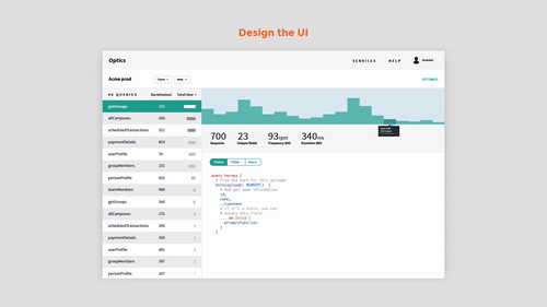
1. Design the UI. Keep in mind where you can re-use UI elements and identify common design patterns like overlays, dropdowns, and drawers.
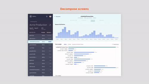
2. Decompose screens into the smallest possible pieces of UI. Designers often refer to this as the styleguide or UI kit. This becomes the specification for the components that engineers build next. At this stage you are identifying the shared components across different screens and tracking the permutations those components need to support in various contexts.
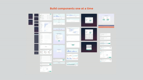
3. Build components one at a time from the bottom up. Construct each component in isolation without relying on business logic or the relationship with other components. At this stage you’re creating the building blocks of your app. Isolation helps you clearly articulate expected behavior for each component context. Use a component explorer tool to help mock up states, generate stubbed data, and stress test your UI in different settings.
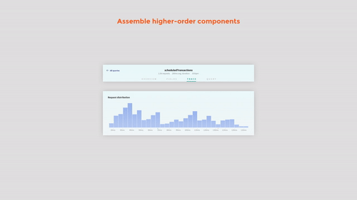
4. Assemble composite components by combining smaller components. In this stage, you’re describing how the individual components you made in step 3 relate to one another. For instance, a tab component paired with graph components yields the visualization carousel.
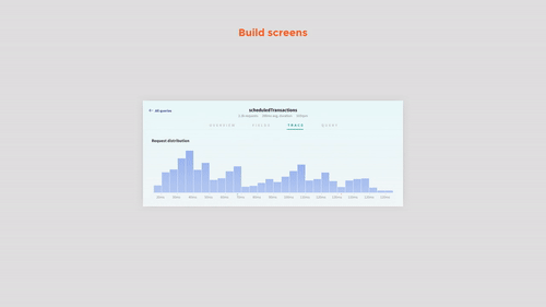
5. Build screens from composite components. We are combining the composite components from step 4 into screens and hooking up the business logic. Rinse and repeat for all your screens.
Conclusion
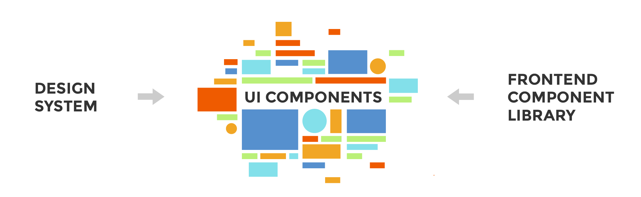
It’s clear that designers and developers have landed on components as the way forward. Although nomenclature is different for each discipline – design systems and component libraries respectively– the basic unit is the same: components.
With the UI Component Playbook you have an overview of the end-to-end production process from the initial design to the final product. Whether you’re an industry veteran or a beginner, I hope this guide gives you a head start in adopting components.
Report back how you fare with the playbook!